


Designing a New Icon System for D-Store
(+ Bonus Illustration)
Introduction
D-Store is a platform that aims to cover the entire F&B ecosystem. Our product supports essential functions and equipment, from customers placing orders, restaurants receiving them, kitchen tickets printing, and managing kitchen stations. It also covers queue systems, reservation management, back-office operations and many more.
Problem
When I joined the project, the existing icon system was inconsistent and messy. Icons had been created by different designers under time pressure, leading to a lack of structure, varying styles and unclear visual hierarchy.
Opportunity
As we were still in the early stage of product development, there was a valuable opportunity to revamp the icon system. By creating a solid foundation early, we could set a clear, scalable standard across all platforms and future products.
Our Goals
- Friendly and easy to understand: Although D-Store is a B2B product, our users are everyday people. Icons needed to feel simple, approachable, and intuitive.
- Scalable: Choosing a line-style design makes the system easier to maintain and expand.
- Consistent: Unifying the visual language ensures better usability across products.
- Correct usage: Building a system that all designers could follow easily, avoiding one-off or mismatched icons.
Process
I kick-started the icon system development when a new project, the mobile POS was about to begin.
1. Start with Basics
I first created the essential general icons (close, arrow, search, more, etc.)
2. Expand for Specific Needs
As our product focuses heavily on F&B and B2B operations, I designed customized icons that reflected our unique use cases.

3. New Request Process
Designers now request new icons when needed. I review and add them into the system, ensuring all new icons stay consistent with the core design language.
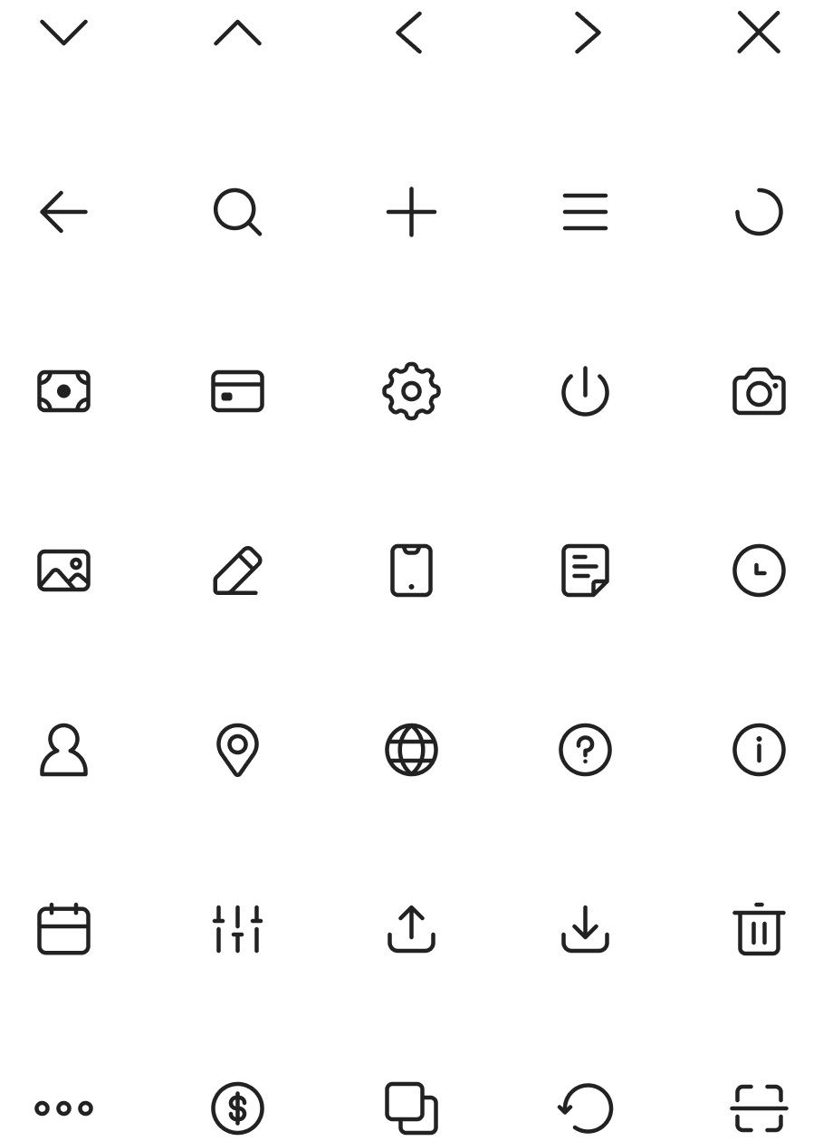
Icon System
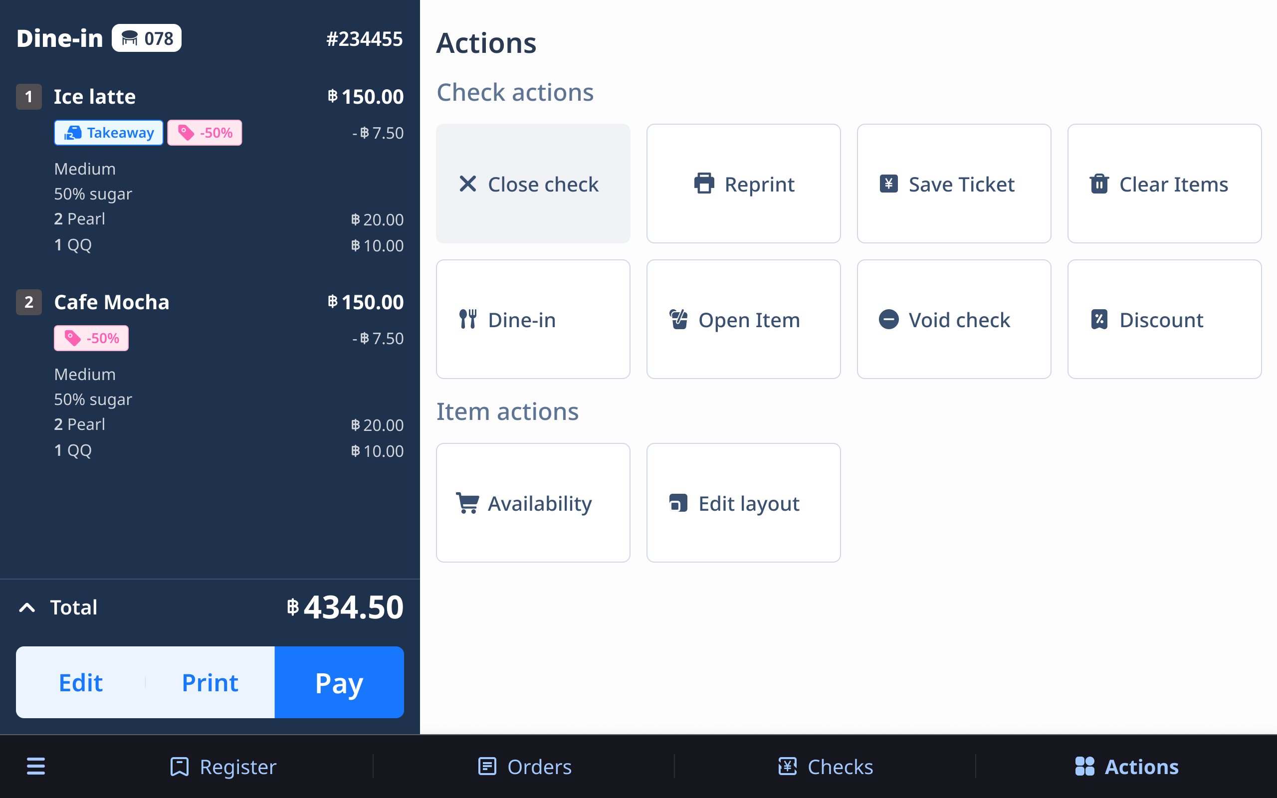
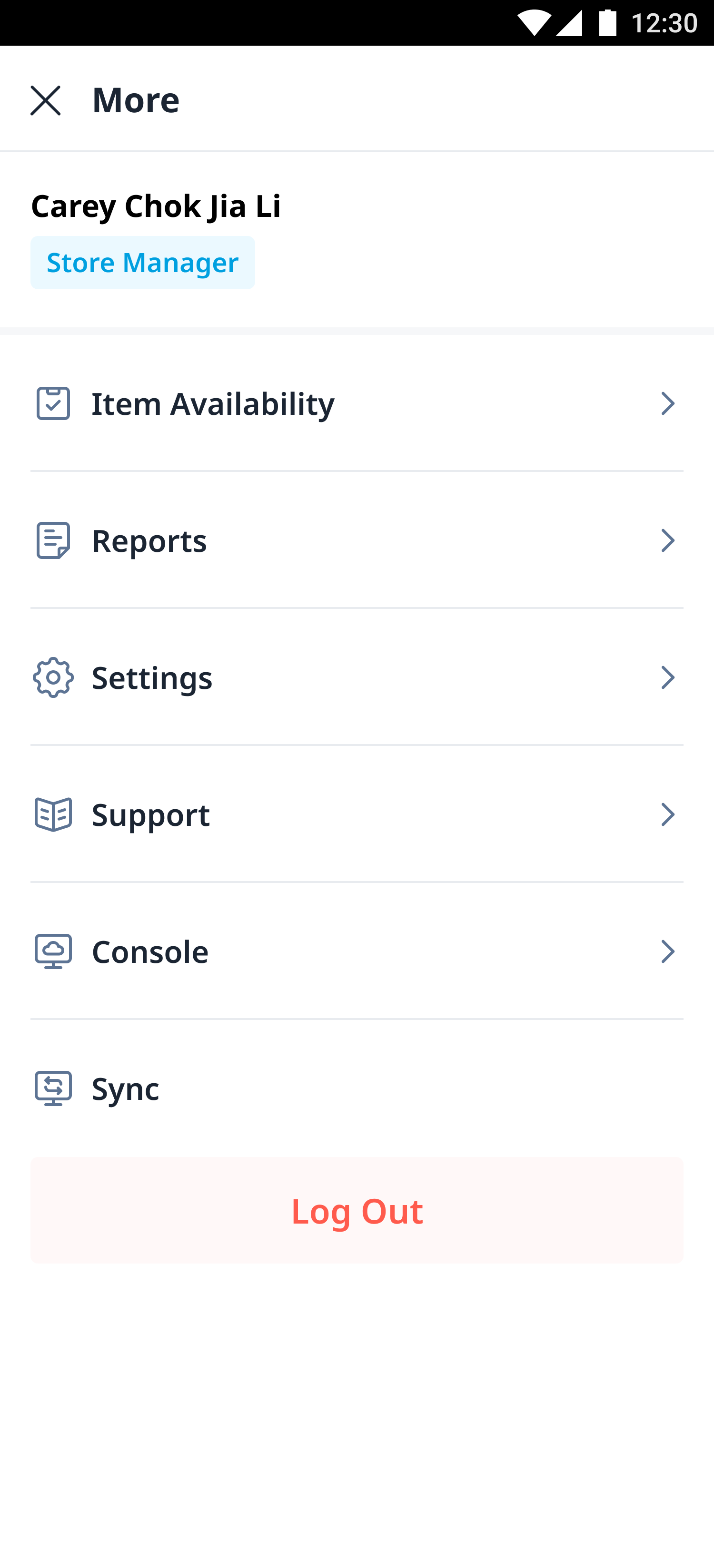
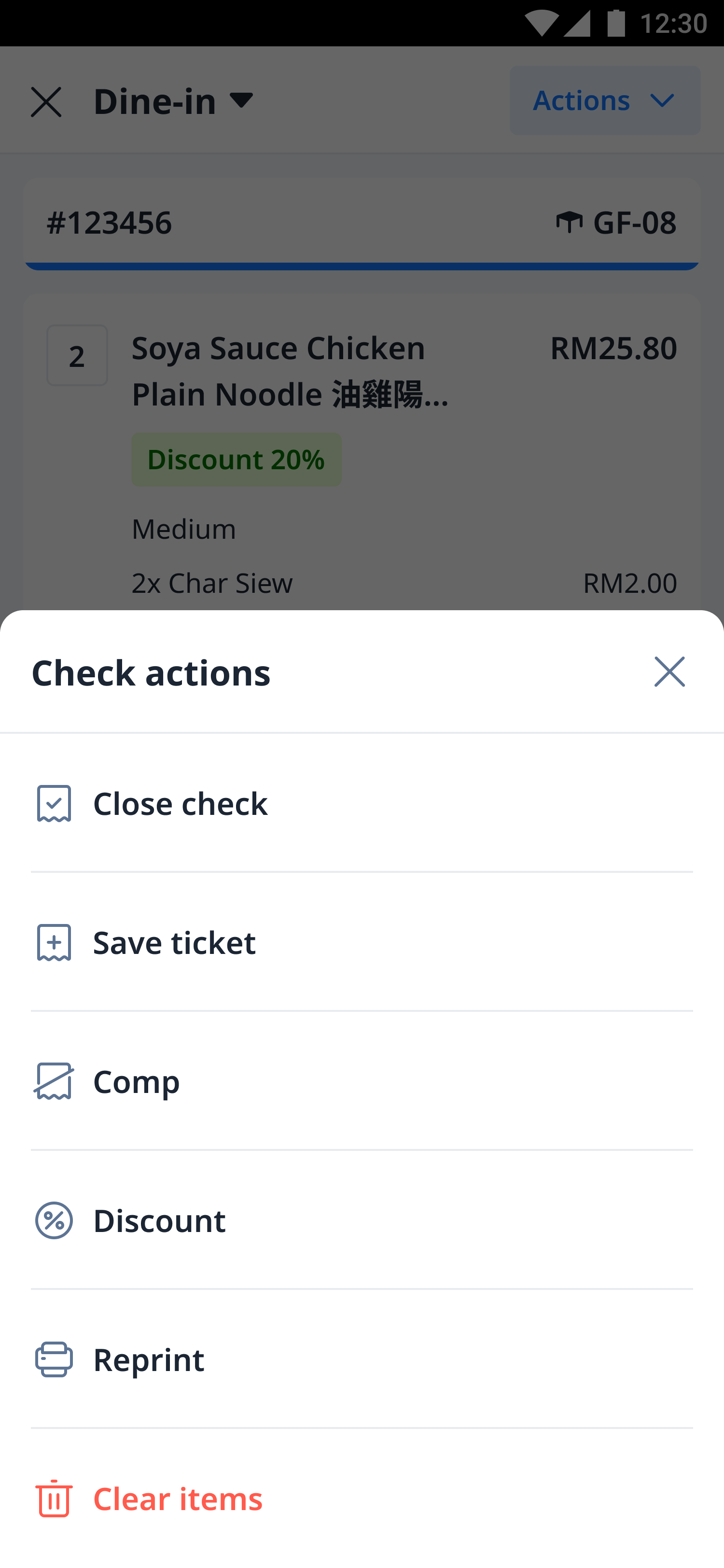
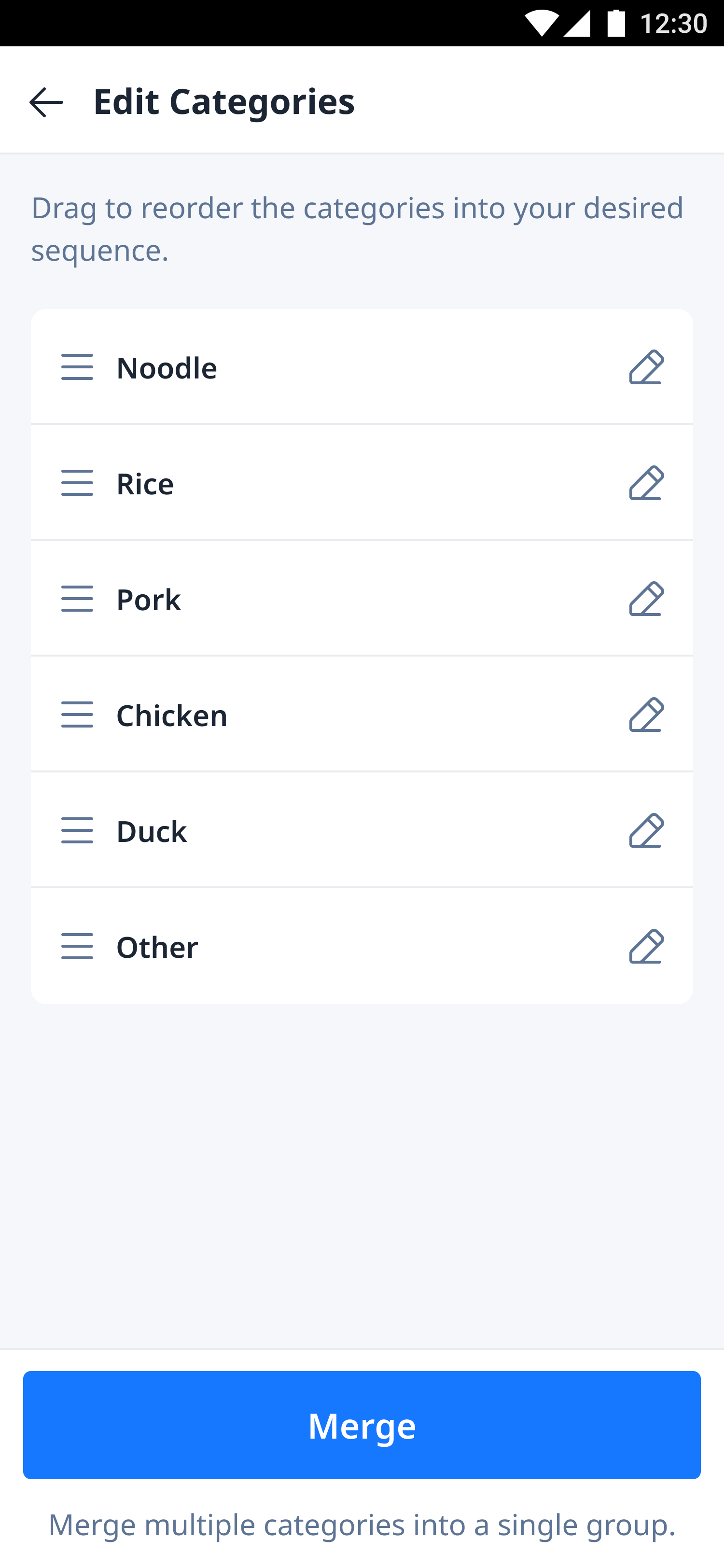
After finalizing the design direction, I organized all the icons into a structured system. Each icon follows the same line style, stroke weight and visual proportions, ensuring a consistent and cohesive look across all platforms.

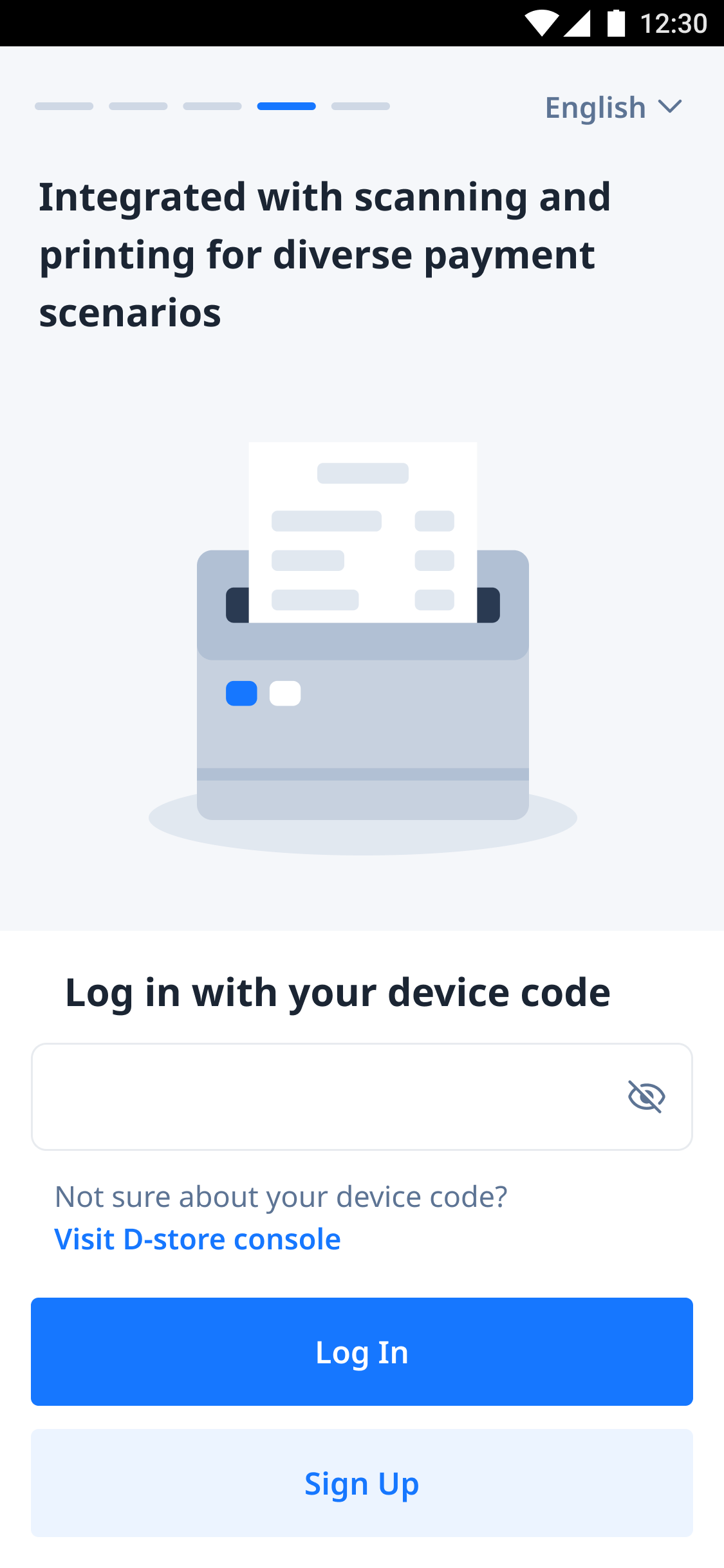
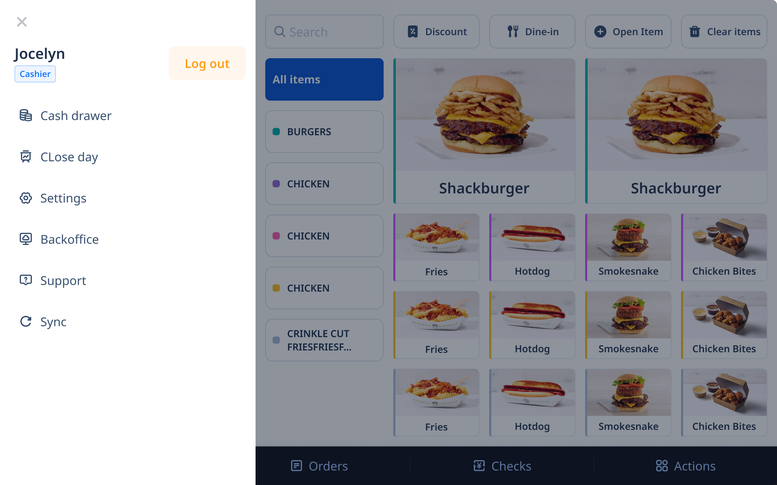
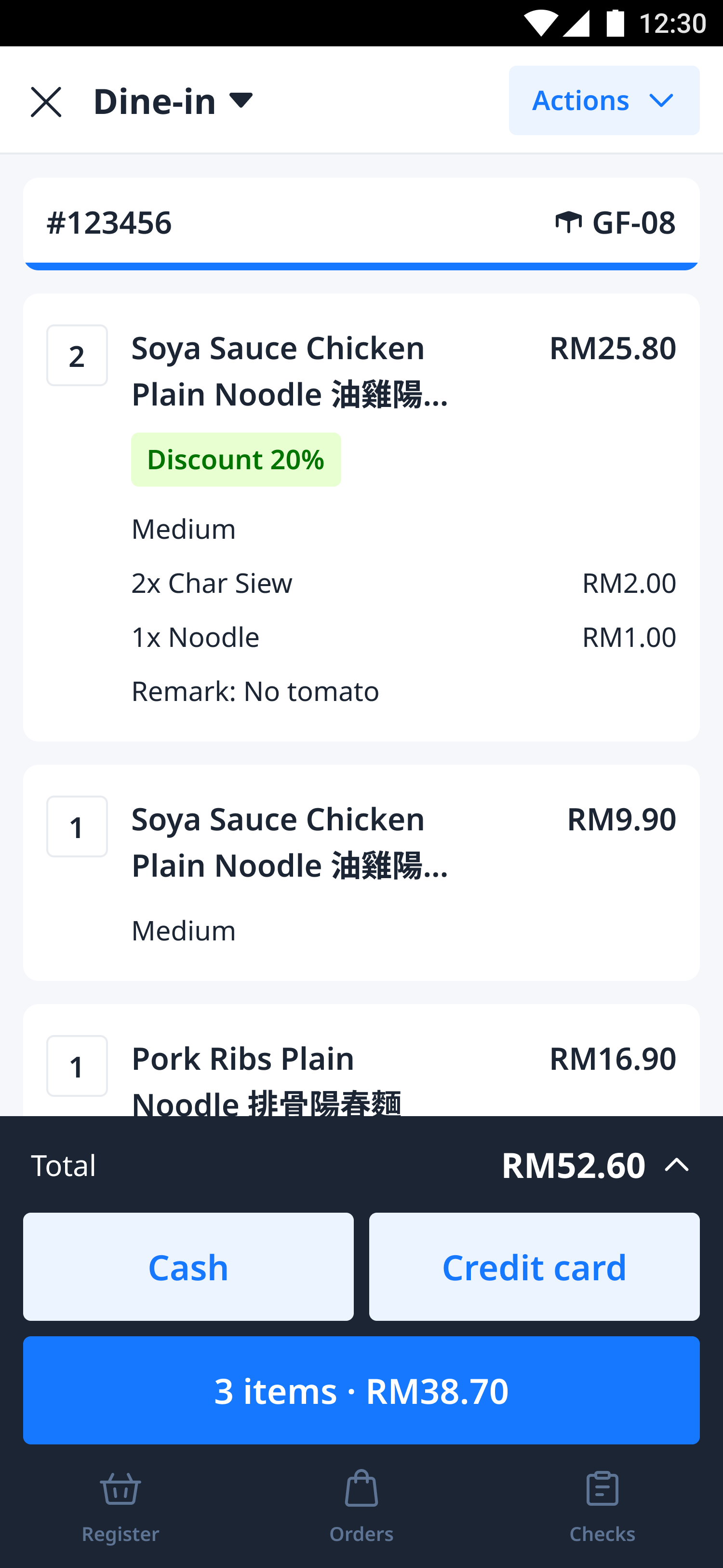
To show how the new icons come to life within real products, here are a few examples from D-Store's mobile.

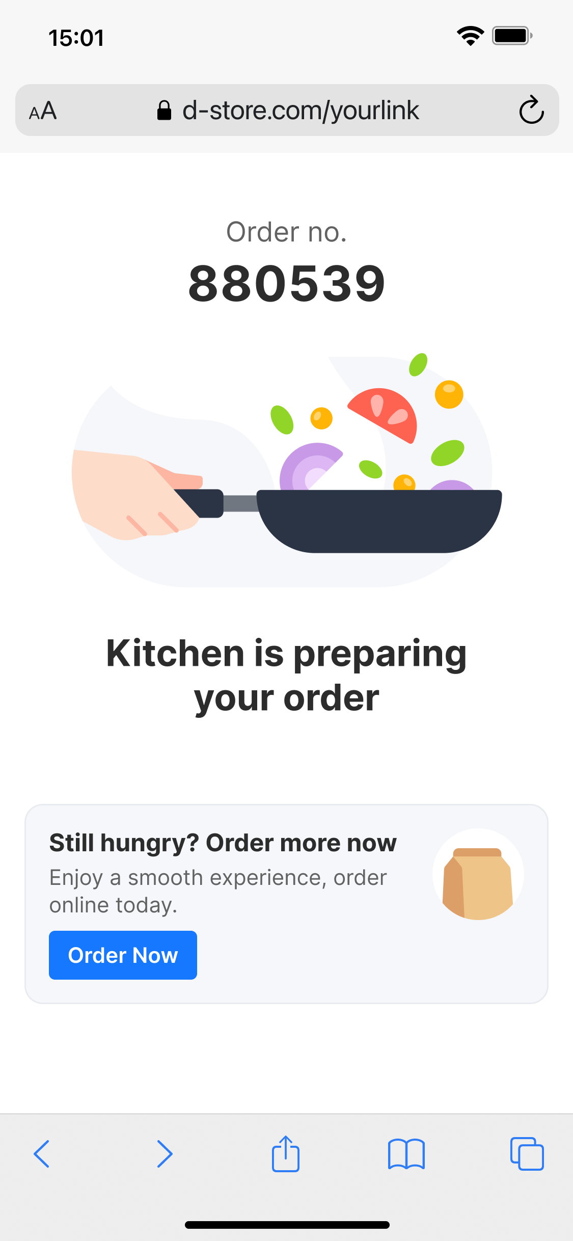
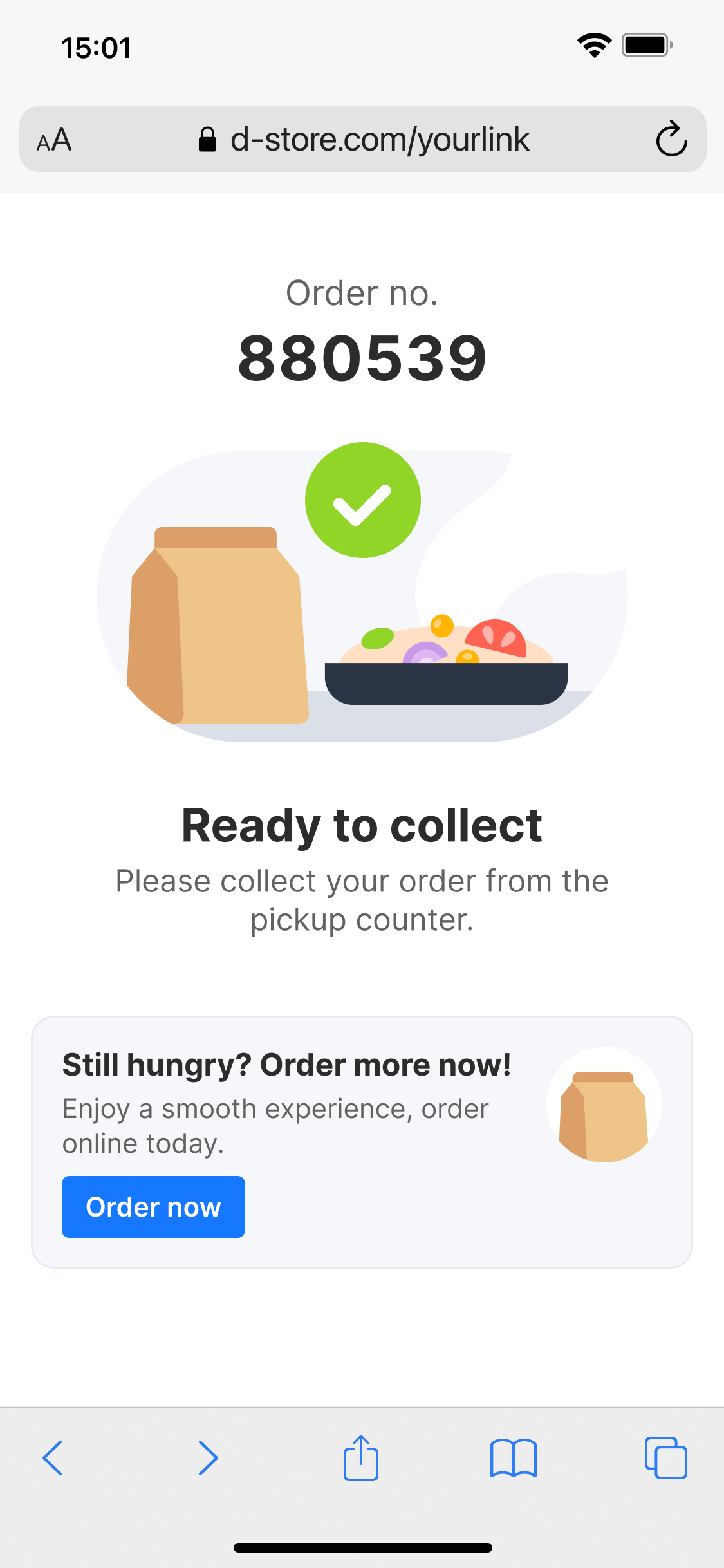
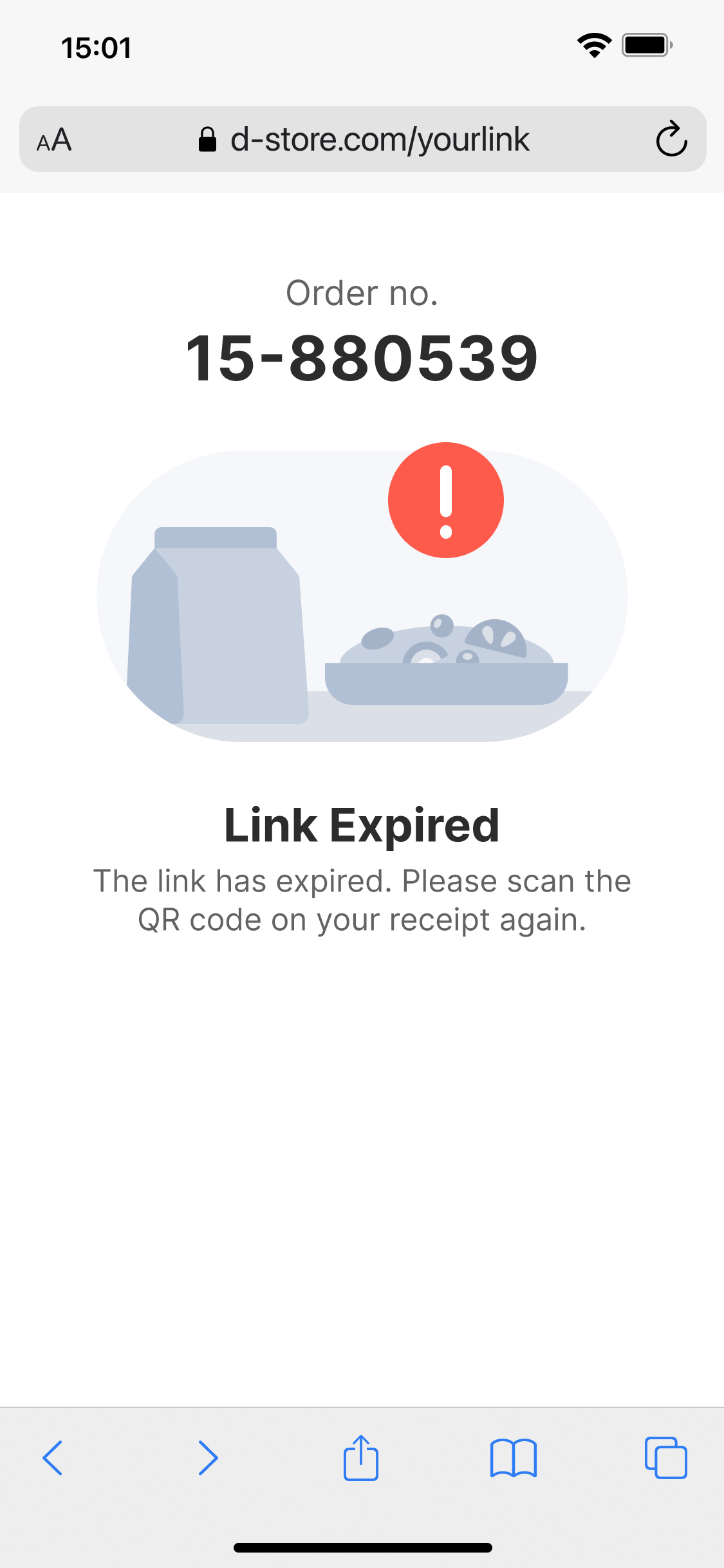
Bonus: Illustration
As a bonus to enhance the brand’s visual identity, I also created a small set of illustrations. These illustrations are used selectively across the platform to add warmth, improve storytelling, and make the product feel more approachable without overwhelming the professional look of D-Store.


Result
Today, our icon system is used by all 5 designers in our team. It has helped us achieve a consistent, scalable and user-friendly visual style across all products. The system has also made the design process faster and more efficient, everyone now has a reliable source to pull icons from without worrying about inconsistencies.
Copyright © moonhuilee 2026


Designing a New Icon System for D-Store
(+ Bonus Illustration)
Introduction
D-Store is a platform that aims to cover the entire F&B ecosystem. Our product supports essential functions and equipment, from customers placing orders, restaurants receiving them, kitchen tickets printing, and managing kitchen stations. It also covers queue systems, reservation management, back-office operations and many more.
Problem
When I joined the project, the existing icon system was inconsistent and messy. Icons had been created by different designers under time pressure, leading to a lack of structure, varying styles and unclear visual hierarchy.
Opportunity
As we were still in the early stage of product development, there was a valuable opportunity to revamp the icon system. By creating a solid foundation early, we could set a clear, scalable standard across all platforms and future products.
Our Goals
- Friendly and easy to understand: Although D-Store is a B2B product, our users are everyday people. Icons needed to feel simple, approachable, and intuitive.
- Scalable: Choosing a line-style design makes the system easier to maintain and expand.
- Consistent: Unifying the visual language ensures better usability across products.
- Correct usage: Building a system that all designers could follow easily, avoiding one-off or mismatched icons.
Process
I kick-started the icon system development when a new project, the mobile POS was about to begin.
1. Start with Basics
I first created the essential general icons (close, arrow, search, more, etc.)

2. Expand for Specific Needs
As our product focuses heavily on F&B and B2B operations, I designed customized icons that reflected our unique use cases.

3. New Request Process
Designers now request new icons when needed. I review and add them into the system, ensuring all new icons stay consistent with the core design language.
Icon System
After finalizing the design direction, I organized all the icons into a structured system. Each icon follows the same line style, stroke weight and visual proportions, ensuring a consistent and cohesive look across all platforms.
To show how the new icons come to life within real products, here are a few examples from D-Store's mobile.
Bonus: Illustration
As a bonus to enhance the brand’s visual identity, I also created a small set of illustrations. These illustrations are used selectively across the platform to add warmth, improve storytelling, and make the product feel more approachable without overwhelming the professional look of D-Store.
Result
Today, our icon system is used by all 5 designers in our team. It has helped us achieve a consistent, scalable and user-friendly visual style across all products. The system has also made the design process faster and more efficient, everyone now has a reliable source to pull icons from without worrying about inconsistencies.
Copyright © moonhuilee 2026